
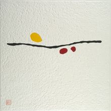
Natu-14
- Medium:
- Mokuhanga (Japanese water-based multi-block woodcut)
- Image courtesy of
- Northern Print Studio (Newcastle, UK)
Description
"Natu" is a romanization of natsu (夏), summer, and the numbered series suggests a sustained engagement with summer as a chromatic and emotional referent rather than a depicted season. Natu-14 likely deploys the saturated warms — reds, oranges, deep blues, intense greens — that Yoshikawa associates with the season's intensity, arranged in shapes that read as energetic rather than descriptive. The mokuhanga technique here would involve a sequence of cherry-block printings, each pulled with the baren over moistened washi to embed the water-based pigment fully into the sheet; the absence of bokashi gradation produces edges that hold color sharply against neighboring fields. The Natu sequence is one of Yoshikawa's named series alongside Private and Kou, marking out a strand of her output organized by mood and color register. Within her four-decade independent practice it sits among the works strongly characterized by her core compositional approach: bold shape, dense color, dynamic rhythm.


![[abstract composition with diagonal woodgrain] by Gen Yamaguchi](https://1.api.artsmia.org/800/135949.jpg)